Towry was one of the UK’s leading financial planning and wealth management organisations. After their acquisition of Ashcourt Rowan in 2015, Towry developed a new brand and business proposition. In addition, Towry’s industry-standard service offering was confusing some of its users. As the user experience lead on this Creative Jar (CJ) project, I was tasked with demystifying the services, integrating the new proposition into the EPiServer CMS, and using this opportunity to create a more engaging, online experience.
Stakeholder workshop and requirements gathering
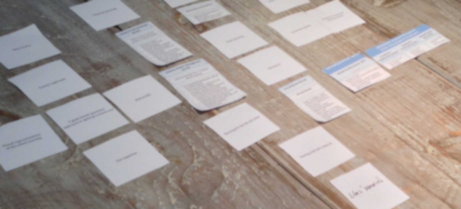
The account team suggested we start the project with a stakeholder workshop to fully understand the brief and new Towry proposition. I was tasked with coming up with the first draft of the workshop agenda and activities, as well as leading half the workshop. Due to the extremely tight project timeline, the workshop objectives focussed on auditing the current website, as well as prioritising and scoping the project. Here is the first draft of the agenda:
- Open discussion about how Towry’s business proposition has changed.
- Simplified card-sorting exercise to integrate new service offering into current information architecture (IA or site structure).
- Evaluation of simple IA approach (from previous step).
- Audit of the current site: This started by focussing on IA, homepage, and the key user journeys. To help jumpstart the discussion with client, I had identified some opportunities in an informal UX audit beforehand and asked the management teams to do the same.
- Group project requirements (from previous step) into specific project tasks.
- Prioritise project tasks, scope what work will fit into the tight timeline, and identify what tasks can wait until a second phase.
- Time-permitting, co-design exercises:
- Homepage content reference diagram co-creation
- Detailed card-sort of Towry’s primary and secondary navigation, including new proposition content
- Map user journeys to IA created in previous step
The user experience team
After the workshop, the management teams created the statement of work (SOW) and project plan, then I started the UX work. CJ had recently gone through some staff changes and Alex Jaques, the managing director was returning to his previous role as creative director and taking over management of the UX and creative teams. While I was the sole UX on the project, Alex was responsible for final delivery. He took a traditional design approach to the project and requested multiple approaches for each deliverable.
The project work started with some pen portraits. I created initial versions and then collaborated with Towry to align the portraits with the industry-standard market segments, namely Experian’s Financial Strategy Segments (FSS).
Demystifying the service offering and information architecture
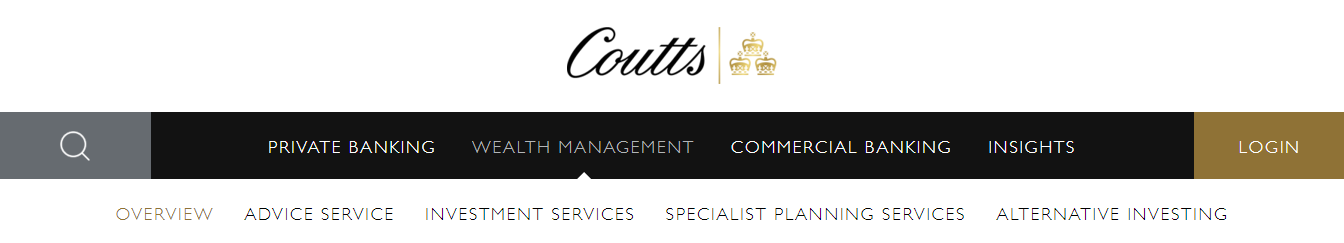
Once we better understood the target audience, it was time to start redesigning the information architecture. The original rebuild had transitioned the primary navigation from an audience focus (e.g., “Private clients”, “Corporations & institutions”, “Professional partners”, as seen on Chase de Vere and Investec’s websites) to a service focus (e.g., “Advice”, “Planning”, and “Investment management”, as seen on Coutt’s new site in the “Investment management” subnavigation). While this approach would certainly be considered best practice in this case, overlapping labelling confused customers. A competitor analysis revealed that “advice” and “planning” are used by convention across the financial services sector. But what is the difference between them? Would prospective customers intuitively understand the distinction? Additionally, these terms were further obscured by using them with synonymous adjectives, like “financial”, “capital”, “holdings”, and “wealth”. Due to the tight timeline, there wasn’t room for user testing. However, since the project brief also clearly identified the service offering as a problem, it was reasonable to assume that the interchangeability of “planning” and “advice” was the root cause.
Industry conventions and navigation ambiguities
I created the following principle to guide my design process:
“Never show ‘planning’ and ‘advice’ by themselves, without further information to clarify the distinction.”
Thus, instead of requiring that a user selects between “planning” and “advice”, more details would always be available. For example, long-term financial plans or specific wealth advice services, like retirement and pensions, demonstrate to the user how these two service pillars differ, introducing significantly more context.
With the design principle as my guide, I explored a host of navigation solutions to clarify the service list:
- “Services”: By convention, many websites start their primary navigation with a “services” list to quickly show users what’s on offer.
- “Financial planning and advice”: Combining the two labels into a single menu eliminates the need for users to decide between them.
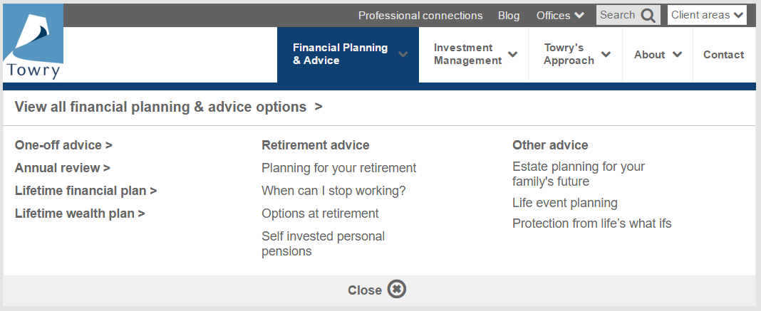
- Separate but supplemented: Some sites use subtitles directly below their primary navigation labels in an effort to reduce ambiguities (See P’unk Ave).
Content requirements
Once the primary navigation, header links, and footer were all drafted and the larger internal team was happy with them, I started the homepage redesign. The homepage was a single CMS template and almost anything was achievable. The first step was to supplement the IA work by adding more content to clarify the service offering. Next I increased the visibility and quantity of action calls to support the primary business goals and fundamental user tasks. Finally, I added new sections to showcase deeper content and support secondary user tasks. After that, I created user journeys based on the pen portraits to informally evaluate the solution so far.
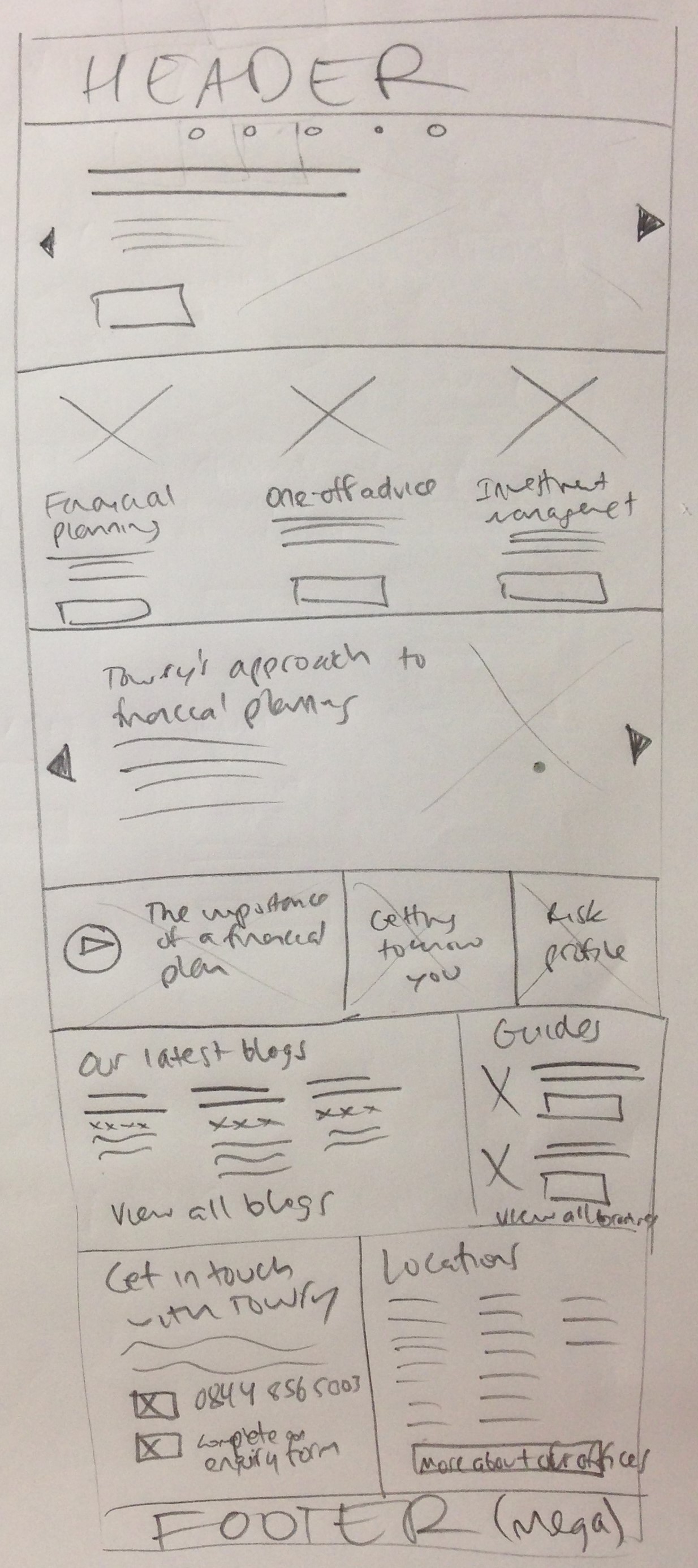
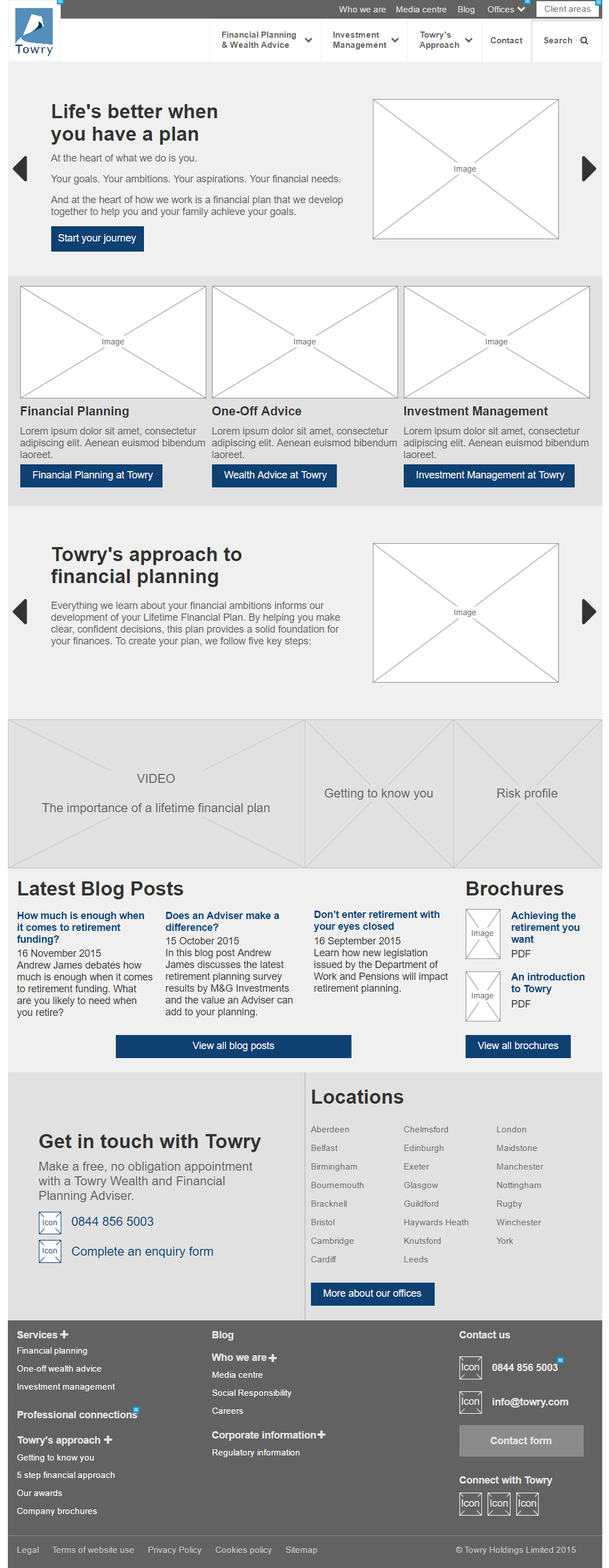
I presented the IA options, proposed homepage content, and user journeys to client. After they selected which direction they wanted to pursue (combined “planning and advice”), I proposed a UX requirement for the 2nd stage of work:
“Every page must have at least 1 image.”
This CMS content commitment would allow any promoted content to include its unique image, drastically increasing the visual appeal of the site. Section (listing) pages would benefit the most, but even content pages would now have imagery for the designer to utilise. The client readily agreed to the CMS change.
Empowering the CMS administrator
The homepage redesign was straightforward. However, the rest of the project required updating most other templates and blocks in EPiServer. As a large-enterprise CMS, EPiServer gives the editor a lot of control. Thus, it was important to learn the Towry CMS inside out. I created test pages to explore where current functionality may have been under-utilised by CMS administrators. This step also helped me identify opportunities to increase functionality, update templates, and design new, reusable blocks.
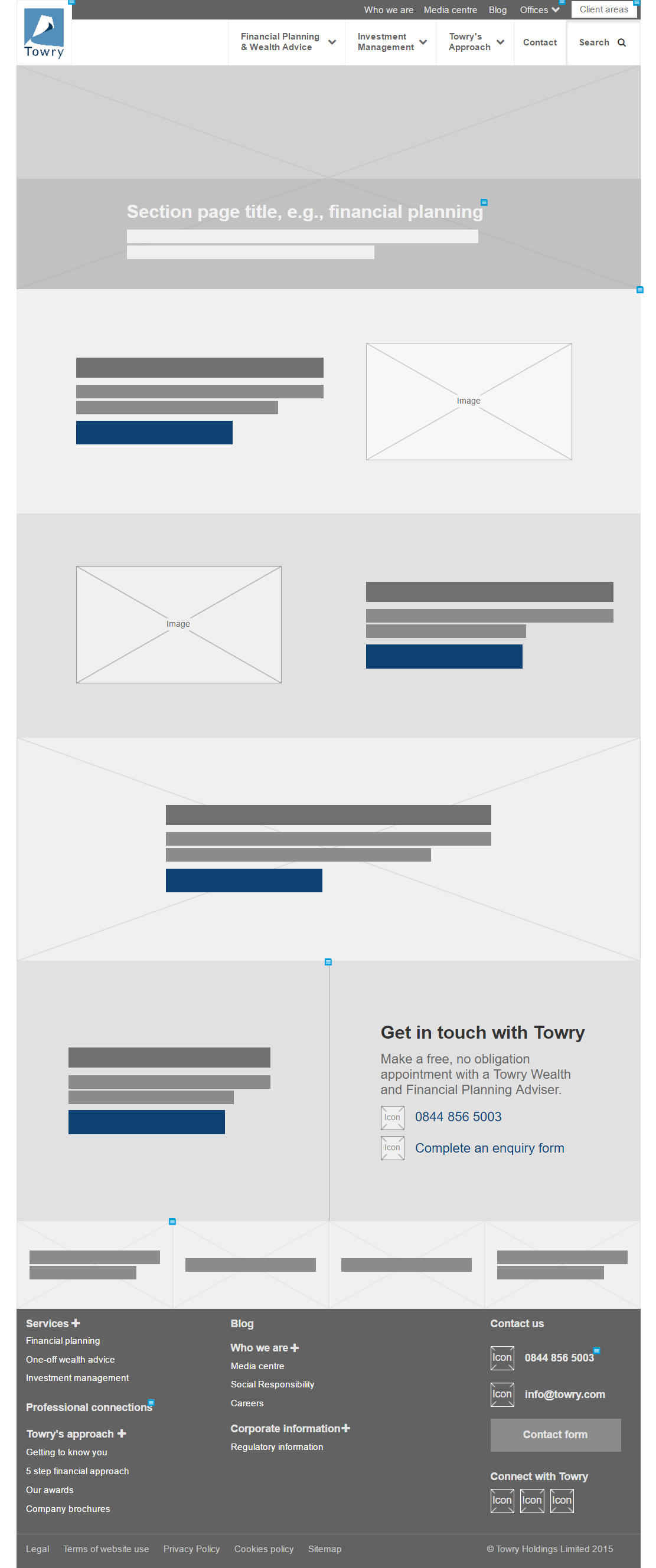
The project brief called for the redesign of 4 key templates. In addition, the content template itself had to demonstrate how 3 new content pages would work. To fit all this in an already tight project schedule, I decided to move to a lower fidelity for the prototypes. While the client did do an excellent job of putting content first in the project, low-fidelity prototypes gave me the flexibility to focus on creating a robust framework for the CMS administrator.
Contemporary web design
The first step in the redesign was to modernise the layout. For example, the current configuration of the section page was using 2 columns, one for the main content area and one for key action calls or supplementary information. While this approach certainly does have its place, there was an opportunity to increase the visual appeal of the page by moving to a single-column layout. Historically, the multi-column technique was introduced at a time when pages were generally quite short. Now that users are much more accustomed to navigating through longer pages, giving the content room to breath is part of contemporary web design. In addition, one of the principles of landing page optimisation is to create a unified flow through the content. Adding columns at the start of the page breaks the top-down flow of the content, increasing the amount and the complexity of the content. As a result, users can often completely miss right-hand column content. I’ve seen this first hand in user tests I’ve conducted for other clients.
I removed one column on every page across the site. The main call-to-action was presented right below the main content, where users would easily find it. Supplemental information or promotional links to other content was available further below. Thus, while the primary content was presented full-width, secondary content could introduce columns to add variety to the page layout without breaking the flow of the page.
Visually appealing, UX architecture
The single-column approach is not without its risks. International usability standards specify a maximum text legibility line length: between 45 – 85 characters. CMS content pages utilise a single-column, vertical layout, where each element must be placed directly above or below other elements. If a UX isn’t careful, the text will naturally expand 120 – 160 characters. All sites struggle with these usability requirements and user experience designers are always looking for new ways to keep content in line.
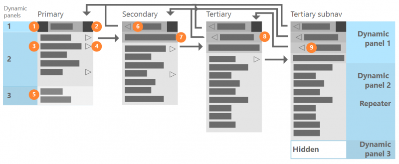
Imagery is a great way to break up the text content. Although finding images for the homepage is never a problem, other templates often encounter this struggle. Since I had introduced the 1-image-per-page requirement to client earlier in the project, I had a good amount of visual content to work with. Thus, a typical, primary navigation, section page with 4 subpages would have at least 5 images to work with: 1 for the page itself and 1 for each of the subpages. I created a new CMS block for subnavigation pages that would include the page name, description text, call-to-action button, and an image. The CMS already allowed the editor to specify the maximum number of blocks to include in a row. For example, 3 subnavigation blocks might display side-by-side on desktop, while each would appear full-width on smaller displays. As a result, creating this single block gave the page creator the power to design a host of unique and engaging page variations.
The project results
Once the new subnavigation and other blocks were designed and played nicely with content created in the rich-text editor, I validated the work by prototyping all the new content pages and key templates. When I presented the work to the client, I used the previous CMS test pages to demonstrate content best practices, as well as which opportunities I explored during the user experience work. Each test page was followed by a prototype of the new design.
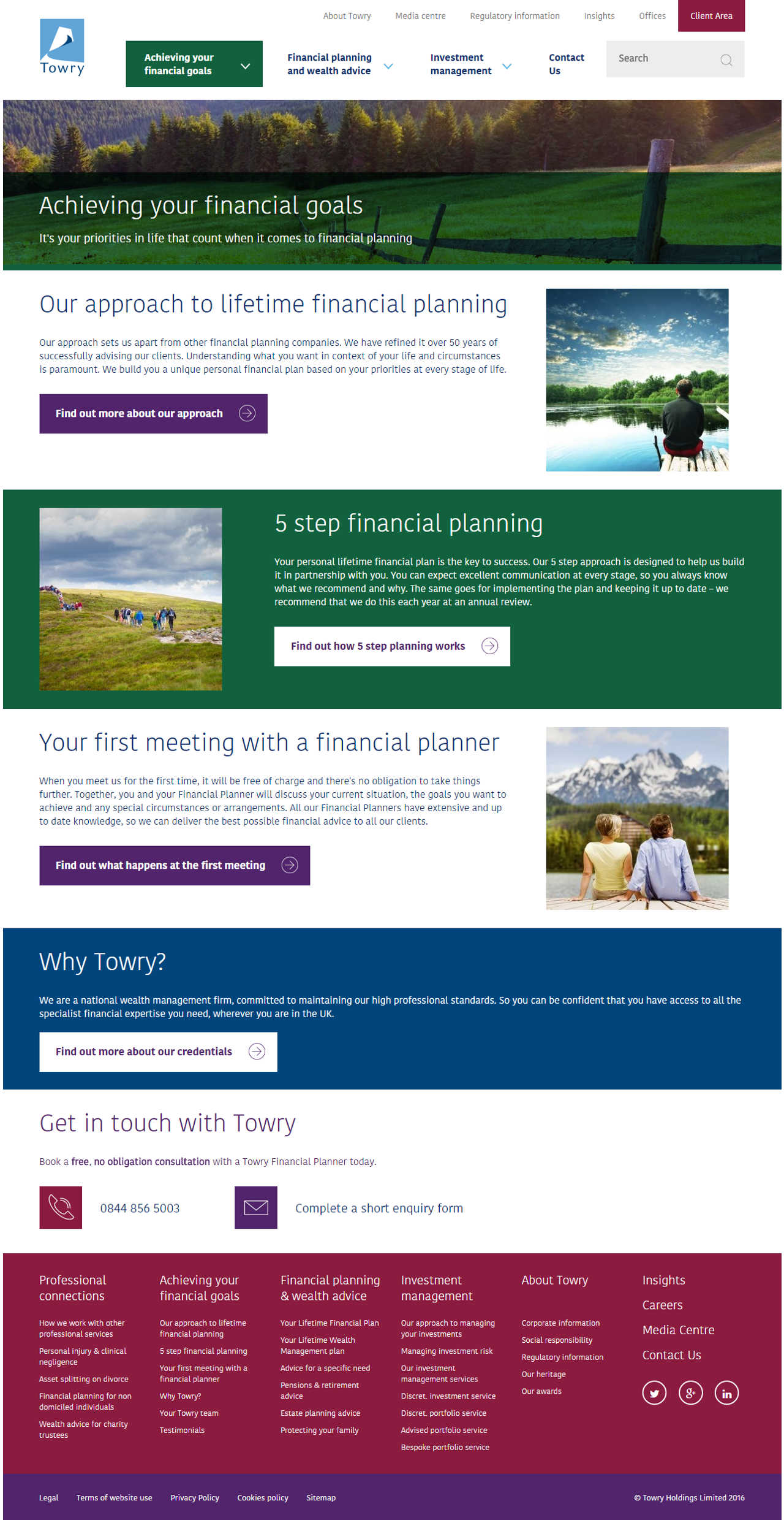
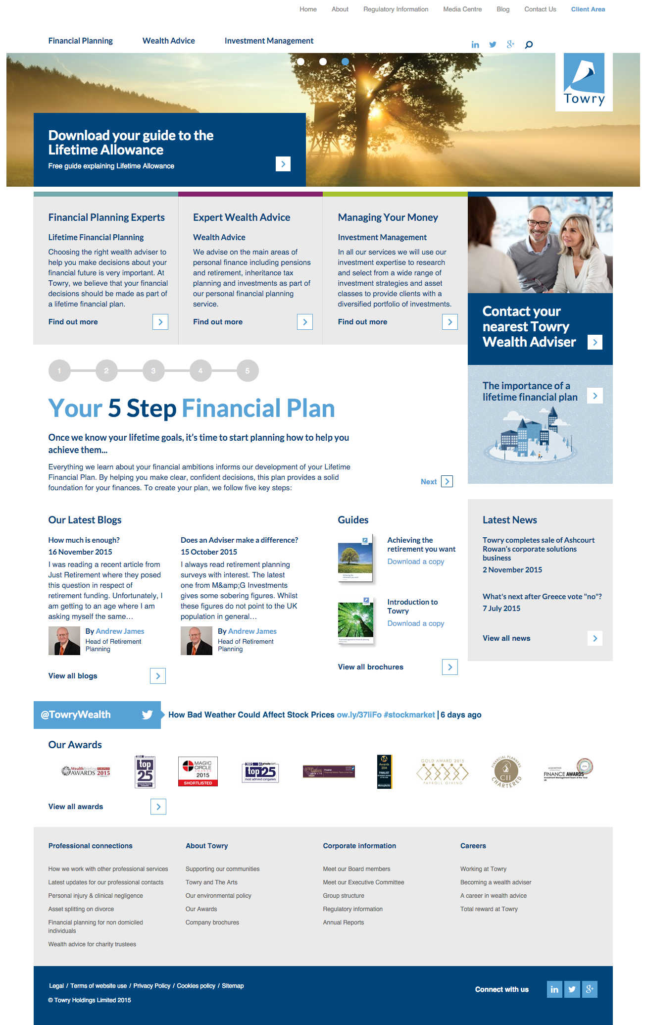
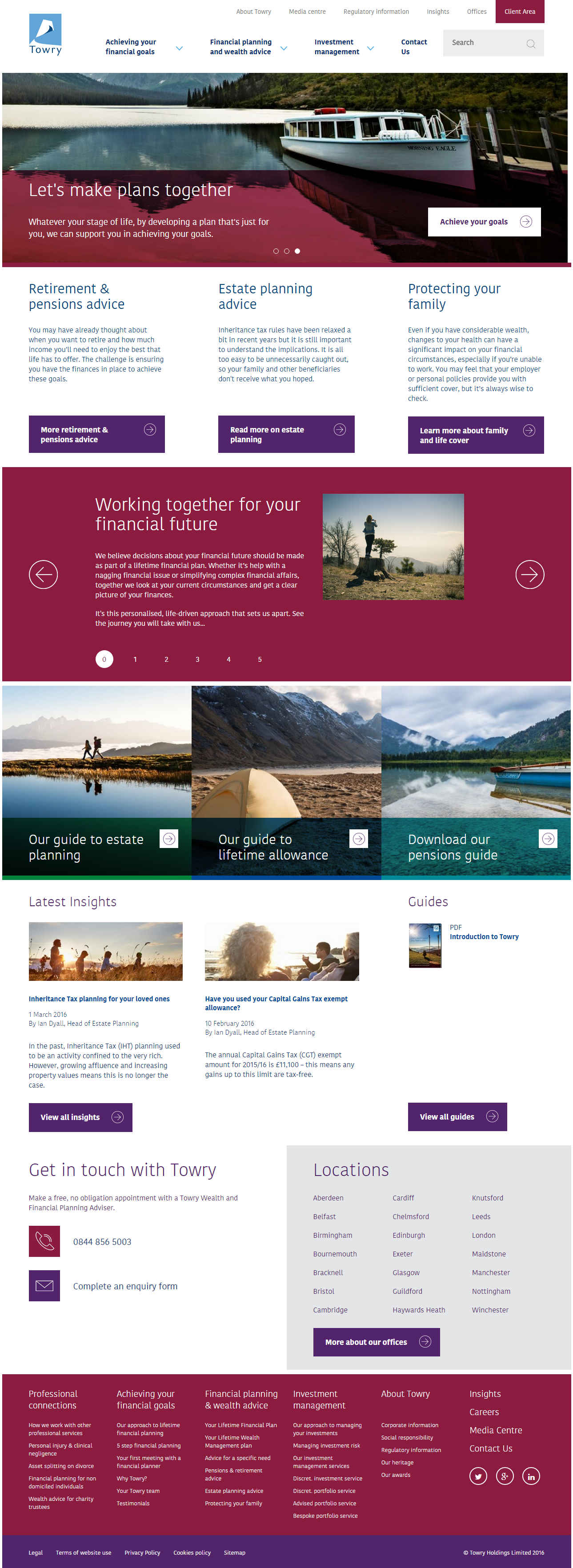
In the end, Towry was extremely pleased with the new designs. Their EPiServer CMS has a significant amount of flexibility compared to the original design. The difference can easily be seen throughout the new site (see the homepage before and after the redesign below). While not everything was able to fit into the first phase of the project and there is certainly more work to be done (there always is), the Creative Jar team and I were able to overdeliver on a short timeline and with a tight budget.