In my research and development time, I created an Axure tool that automatically creates a full mobile menu prototype from spreadsheet data. The project was feature on the Axure Blog. Hopefully, this mobile menu tool will immediately save you days of work.
Download the Axure 7 RP starter file
Demo the menu interaction
Test data
Below I’ll describe how to utilise the off-canvas, mobile menu framework. Before then, it would be worth explaining how I came to develop this menu prototype and when you should use it.
While repeaters were introduced as part of Axure 7 in December 2013, I didn’t start experimenting with them until September 2015. I mistakenly believed that they were intended exclusively for tabular data. It wasn’t until a tight deadline on a table-based calculator project forced me to hack together a prototype with screenshots that I was determined to master this final Axure functionality.
As I began to learn more, I realised I might be able to simplify my workflow using repeaters. Testing out the repeater functionality on a listing page revealed some limitations. The mobile menu was my second attempt at testing the limits of what is possible with repeaters. I set myself the challenge of creating a deep, 4-level mobile menu without manually having to create over 20 different menu states.
…And it worked.
I know some of my Lean UX peers are probably asking why not simply demonstrate the full menu depth with a single path and explain the limitations to client. While I’ve used this approach in the past and generally use the fastest, simplest technique to communicate an interaction, some clients just want it all. They understand that the additional work will take more time and budget. However, their internal workflow may require a fully-realised prototype. This is especially important when they have internal or off-shore development teams. I call this approach “Fatty Tuna UX”, after the expensive sushi ingredient. It isn’t “bloated”, it’s beautiful and luscious.
Introducing the menu framework
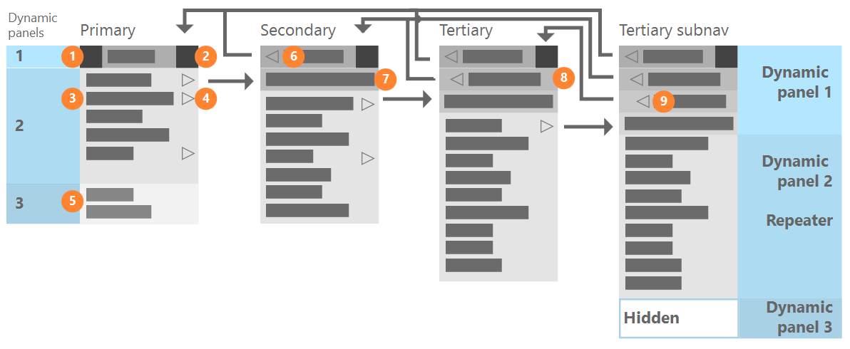
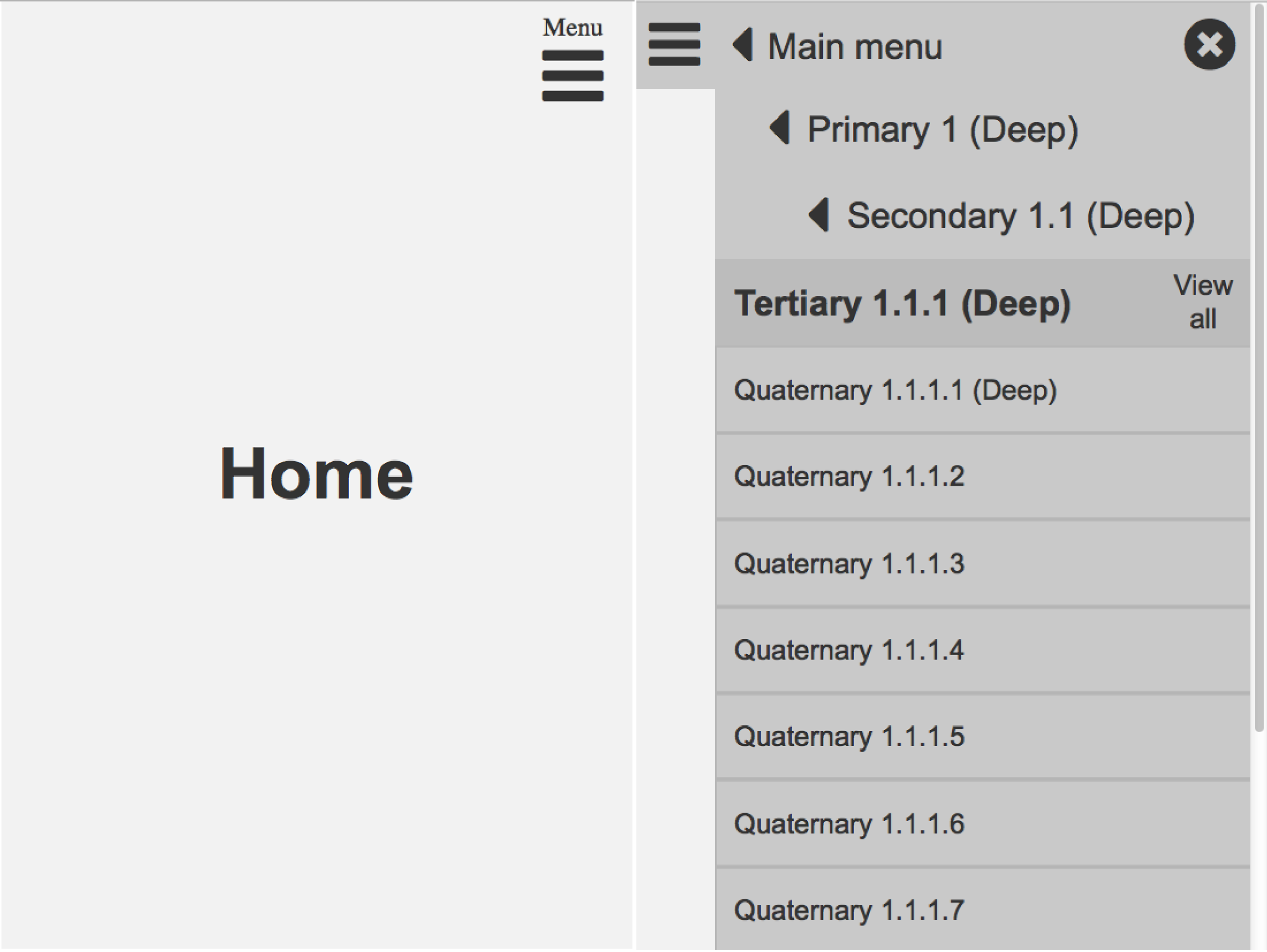
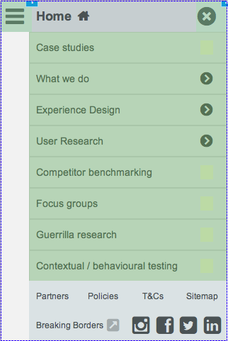
At the heart of the automation is an off-canvas mobile menu that opens on the current page. This allows users to quickly access the page’s subnavigation. If the page does not have any pages beneath it, its parent page is opened and the sibling pages are shown. The menu includes footer links at the primary level and shows breadcrumbs as users dive deeper into the site structure. While deep, off-canvas menus haven’t yet established any conventions, this menu is one of the most robust options. Hopefully, it will work for your needs.
Full list of the prototype’s features:
- Opening menu show subnavigation of current page, effectively overriding the menu’s last state when closed.
- Home icon and link available in menu’s first level.
- Close icon always available in top left of menu.
- Header navigation included on the main menu only (menuFooter dynamic panel).
- Every menu item that has subnavigation visually indicates (right arrow icon) that more options are available to set user expectations.
- Menu arrow behaves the same as its corresponding text, opening the next level down (subnavigation) in the menu.
- “Home” replaced by “Main menu” back button on all lower level menus. This element does not change between lower level menus.
- All menu levels except “Home”, primary navigation show “View all [menuItemLabel]” to allow access to the listing page itself.
- All tertiary menus and below show the full breadcrumbs trail as “Back” links. This structure allows mobile users who have entered the site at a page deep in the hierarchy to orient themselves.
How to use the menu framework
Tutorial difficulty: Easy (no previous repeater experience needed)
Estimated completion time: 20 minutes
- Download the Axure 7 RP file: https://uxmonty.com/downloads/Automated-mobile-menus-Webster-1.0.rp
- Format your sitemap spreadsheet.
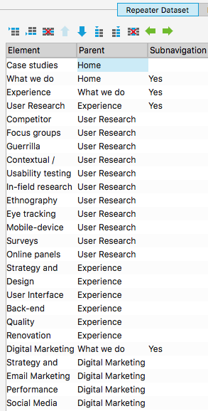
This is the most important step. All conditionals and repeater integrators are expecting the spreadsheet data in a particular format. Ideally, this data would closely match established sitemap spreadsheet conventions. However, I did have to make some compromises to limit Axure complexity.- Columns must use the following labels: Element, Parent, Subnavigation.
- The Element column is required and should be filled with the menu item labels. The “Home” menu item is contained in the menuHeader dynamic panel and should not be contained in the Element column.
- The Parent column is also required and should contain the menu item’s top-level menu. All primary navigation elements must use “Home” as their Parent.
- The Subnavigation column is optional.
- If the menu item has subnavigation, this cell should not be empty (I simply put “Yes”). This tells the repeater to display the subnavigation icon and to open the submenu when clicked.
- If the menu item does not have subnavigation, just leave that cell blank. When clicked, the pageTitle will be “selected”, the menu will be closed, and the content label will be updated.
The menu repeater data is filtered on the currently selected page or that page’s parent if it doesn’t have subnavigation. Thus, the menu item rows do not have to be in any particular order, nor should the column order matter.
- Copy your spreadsheet into the repeater dataset tab in the REPEATER dynamic panel.
- Update (or delete) the MenuFooter dynamic panel with relevant footer links and social icons: Optional.
- Preview and publish the navigation.
Future work and limitations
While I’m quite satisfied with all the functionality I managed to squeeze into this prototype, my work is never done.
Menu height and scrollbar
The most important shortcoming of the menu is that the vertical scrollbar displays unnecessarily. Sadly, I didn’t have time to sort this out. Since the menuHeader dynamic panel increases in size as the menuDepth increases, the REPEATER dynamic panel should correspondingly decrease the same size. I’ll have to leave this for another day; it is a prototype after all.
Menu depth and breadcrumbs
Listing the breadcrumbs in the mobile navigation is an approach that is only relevant for 4-level deep IA and shorter. At the 4th level, the menu chrome is already taking up approximately 40% of the 480 px menu height, so adding more breadcrumbs would obscure too much of the menu content. Information architectures that need to go deeper should use a back button instead. In the future, I would like to develop this alternative menu framework.
Not adaptive (or responsive)
We usually do desktop and mobile adaptive Axure prototypes for our clients. With this in mind, I created the automated menu as a standalone item that can be included in small, adaptive views, while a different navigation paradigm is used for larger viewports. Projects or teams that generally also include a mid-sized viewport or use an off-canvas menu at large screen sizes might consider adding that view to the automated menu starter file.
